






Introduction
Last spring I stood in my living room holding two paint swatches, one “soft sage” and one “dusty olive.” Under the shop lights they looked identical. On my wall at 4 p.m. they looked like two completely different colors. One made the room feel calm and airy. The other made it feel like a cafeteria from 1987.
That little disaster taught me about sage green than any design magazine. It is gorgeous color but it behave differently in every home. Get it right and room feel like a deep breath. Get it wrong and it just looks muddy
So here are ten sage green accent wall ideas I have either tried myself helped friend with seen work really well. I have also included the mistake to dodge.
Why Sage Green Works So Well
Sage is gray leaning green softened with a touch of earthy warmth. That is why it feel natural instead of loud. It sit somewhere between a neutral color so it pair with almost everything.
It has also stayed popular for year now which usually mean a color is more than passing fad. People want home that feel restful and sage deliver that without being boring.
The other big benefit flexibility. Sage look fresh with white crisp with black. It also looks warm with brass wood and terracotta. You rarely have to redo the whole room around it.
The drawback? Lighting. Sage changes more than most colors depending on the sun your bulbs and the surrounding walls. I’ll come back to that, because it matter.
Classic Matte Paint
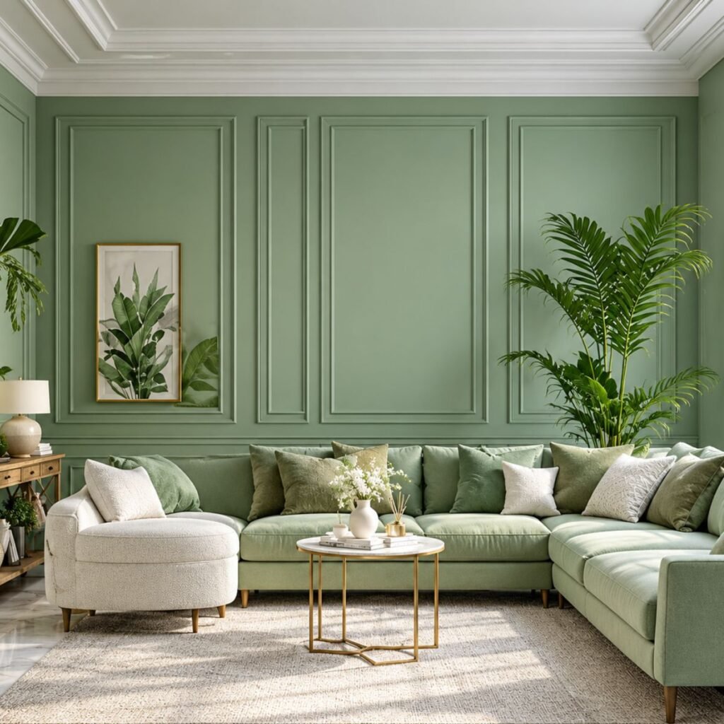
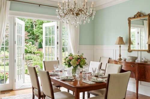
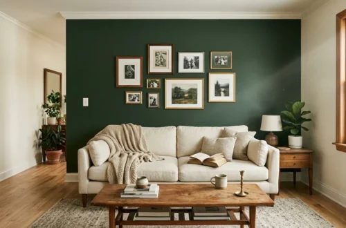
Let’s start simple. A single wall in a good matte or eggshell sage paint is the easiest way to try the color. It is cheap, it’s quick and you can undo it with a weekend and roller.
Pick the wall your eyes land on first when you walk in. That is usually one behind the sofa the bed or dining table. Leave the other a warm white so the sage can breathe.
Based on my experience matte finish hide Minor wall flaw better than glossy one. They also Create color look softer and more Refined
One tip always buy sample pot and paint a big square at least two feet wide. Watch it for full day before committing.
Board and Batten
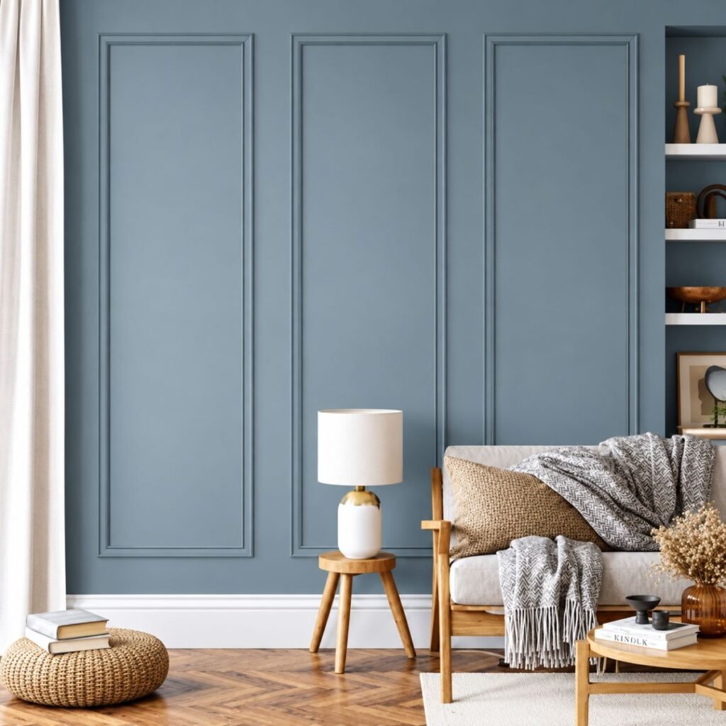
This one changed how I think about accent walls. Instead of just painting you add vertical wood strip to create a paneled look, then paint the whole thing sage.
The shadows between the strip add depth,the color look richer. It also make a plain room feel like it has actual architecture.
It’s a surprisingly beginner friendly DIY. You need MDF strip a construction adhesive, a small nail gun or finishing nails, caulk. The caulk is the secret. It hides every gap and makes it look professionally done.
I’d suggest painting the batten and the wall the same sage, in a satin or eggshell finish. It looks seamless and calm.
Sage Behind the Bed
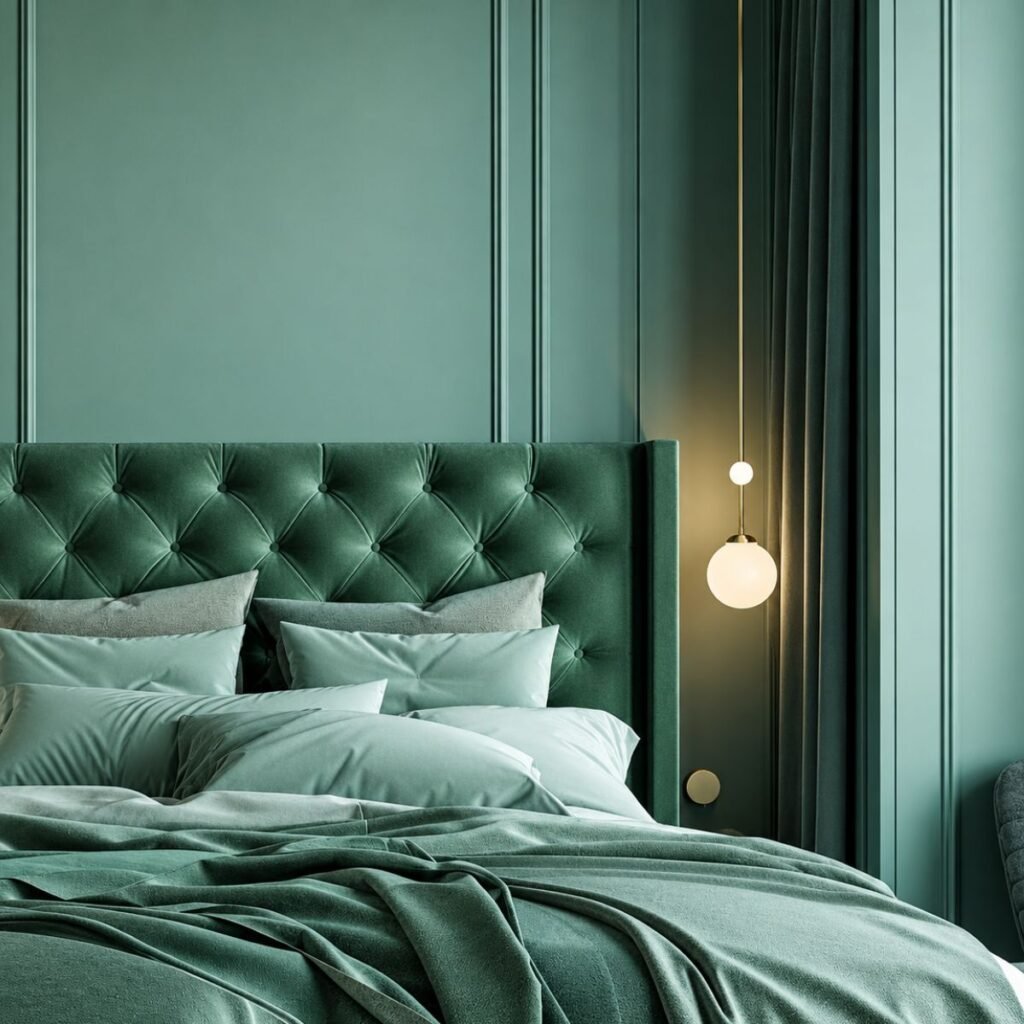
Bedrooms might be the best place for this color. Sage is relaxing, and a headboard wall gives you a built-in focal point.
Here’s what usually works:
- Choose a slightly deeper sage for wall behind the bed since it frame the headboard nicely.
- Pair it with white oatmeal bedding for hotel calm feel.
- Add linen curtain in warm neutral to soften the green.
- Keep lighting warm. Cool white bulb can turn sage a bit gray and sad.
A friend of mine did this in her small rental bedroom using removable peel and stick wallpaper in a sage tone. Her landlord never noticed and she took it with her when she moved Smart.
Color Drenched Corner
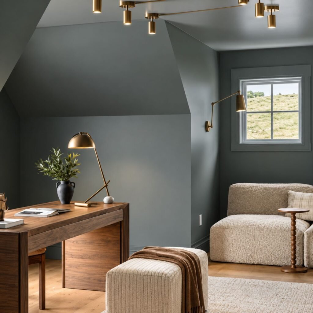
If you want something bolder try painting corner including the ceiling above it in same sage. Designer call this color drenching and it makes a nook feel cozy and intentional.
It works especially well for reading corner small desk spaces or the area beside a window. The color wrap around you instead of just sitting flat on one wall.
Use a slightly deeper sage here, since extra surface area makes the color feel lighter than it really is. A matte finish keeps it from looking shiny on the ceiling.
I tried this above my reading chair and honestly, it is the spot in my house where I now spend the most time. Weird how a little paint can do that.
Sage and Warm Wood
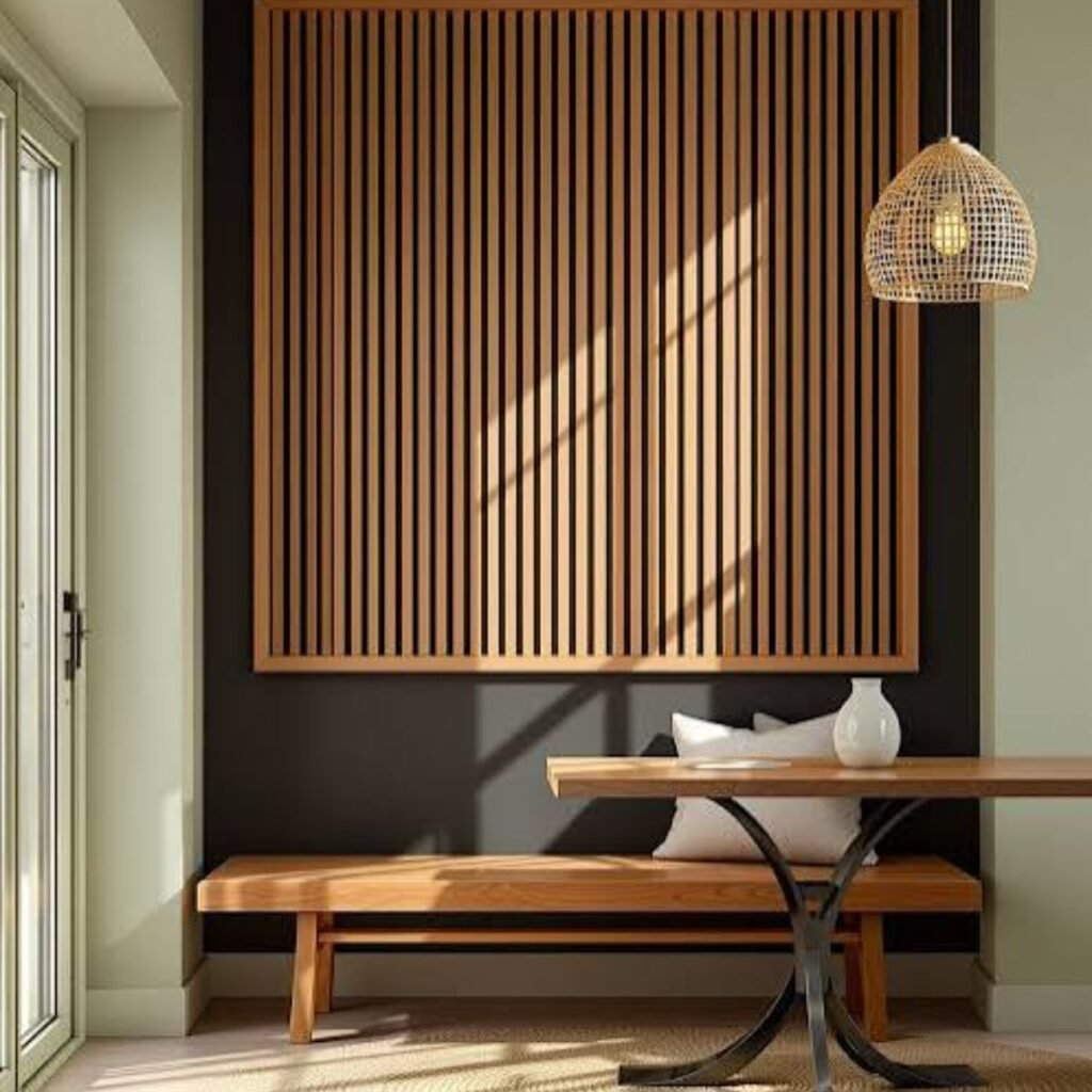
Sage and wood are best friend. The green looks fresh against oak walnut or even pine, and the wood stop the color from feeling too cool.
Try a sage wall with a wooden sideboard in front of it, a wood framed mirror a simple floating shelf. Even a wooden bed frame against sage wall look great.
A few thing that make this combo shine:
- Mix wood tone but keep them in same warm family.
- Add one metal accent like aged brass or matte black.
- Bring in a plant or two. Green on green surprisingly lovely.
Limewash or Textured Finish
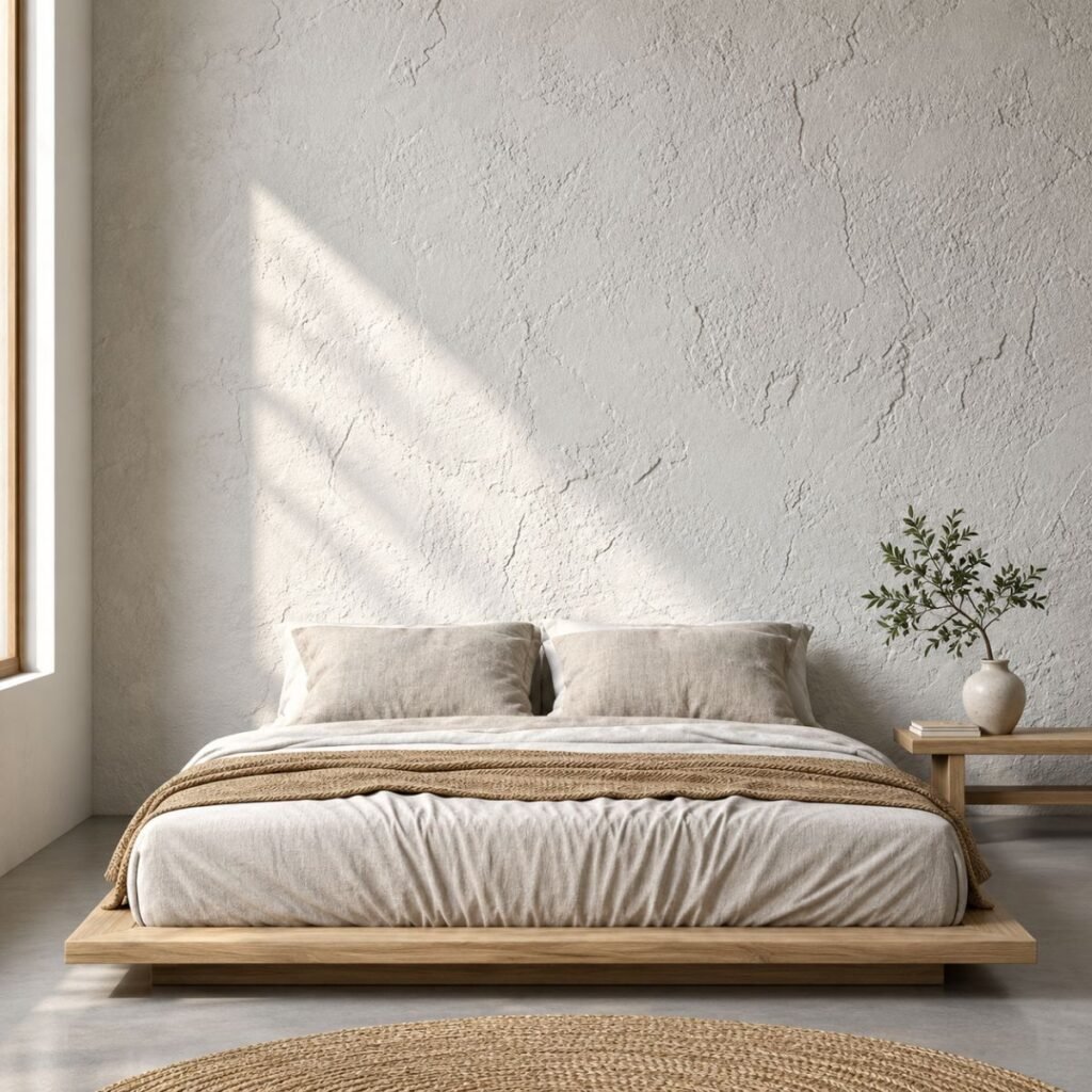
Flat paint is great, but limewash gives the wall movement. The cloudy, slightly uneven look makes sage feel like it’s been there for a hundred years, in the best way.
You can buy limewash-style paints that are easier to apply than traditional lime. They’re applied with a wide brush in crisscross strokes, and the “mistakes” become part of the charm.
It’s more forgiving than you’d think, but it does take patience. Practice on spare board first. Remember that limewash dries lighter than it look wet, so wait before panicking.
This finish suits cozy, rustic style space particularly well.
Sage Behind Open Shelving
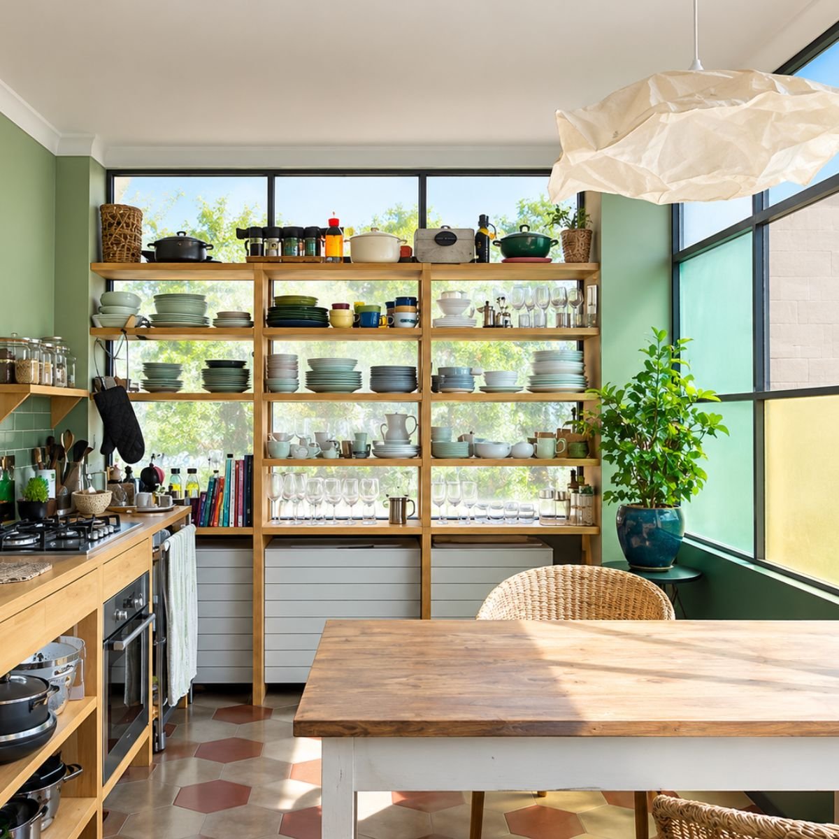
A sage wall behind shelve is a clever way to show off your thing. Ceramics books and framed print all pop against the green background.
It is also a nice trick for a bland shelving unit. Paint the back panel sage and suddenly even basic bookcase looks custom.
Keep your styling loose layered. Group objects in threes, mix height and leave some breathing room. White and cream piece look fantastic here and so do warm terracotta one.
If your shelve are built in painting the inside sage while leaving frame white is a high impact, low-effort upgrade.
Sage Kitchen Accent
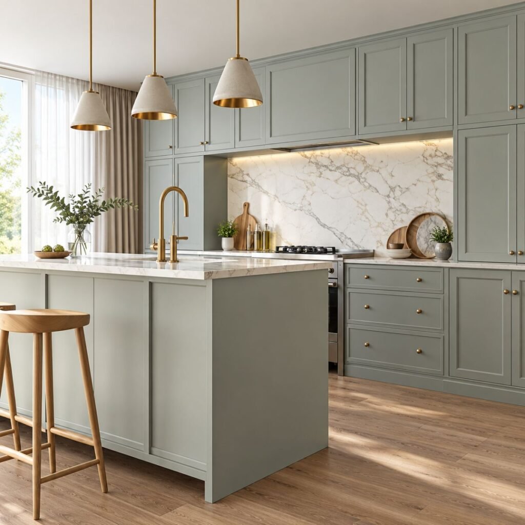
Not every kitchen can handle new cabinet but almost any kitchen can handle one painted wall. A sage wall near the dining nook or beside window instantly soften the space.
If you do have a bit more budget sage backsplash tile is gorgeous. Handmade look ceramic tile in muted green catch the light beautifully.
Pair the wall with white countertop wooden cutting board and brass hardware. Wipeable paint must here so choose scrubbable satin semi gloss for area that might get splashed.
Just be careful strong yellow toned lighting in kitchen as it can push sage toward olive.
Arched Geometric Shape
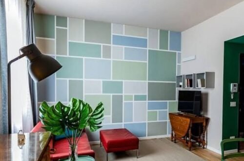
This is for the playful decorator. Instead of covering whole wall paint an arch a bold shape in sage behind a bed, sofa or desk.
An arch behind headboard look soft and modern. A tall rectangle behind a console table work as faux mirror frame. You can even use shape to define workspace in a studio apartment.
Use painter tape and pencil with a string for clean curve. Take your time because crisp edges are what make it look deliberate.
Sage Home Office Wall
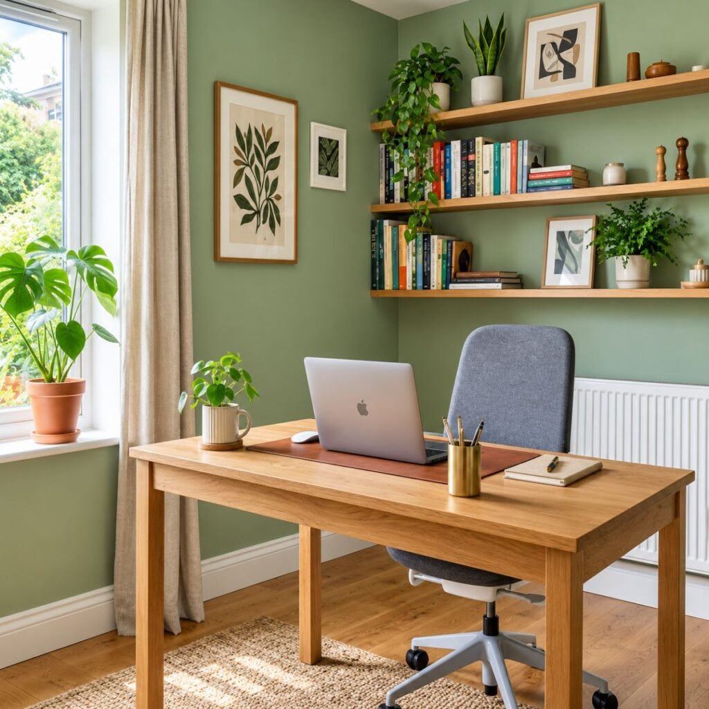
Working from home taught me that your background matter and not only on video calls. A sage wall behind your desk reduces visual noise and keeps room feeling calm.
It’s also camera-friendly. Sage reads well on screen without that harsh glare you sometime get from stark white.
Add a floating shelf a small plant and a framed print, and you have got a neat professional backdrop. A natural light source from the side helps keep the color true.
I switched to a sage office wall last year and my desk area stopped feeling like cluttered corner and started feeling like a proper workspace.
Common Mistake to Avoid
I’ve made most of these, so learn from my pain:
- Skipping the sample. Always test color on actual wall in morning afternoon and evening light.
- Ignoring undertones. Some sages lean yellow others lean blue gray. Check your floor furniture and curtain before choosing.
- Using cold bulb. white Warm bulbs around 2700K to 3000K usually flatter sage best
- Picking the wrong wall. The accent wall should be a natural focal point not random one.
- Forgetting the finish. Too glossy and it show every flaw. Too flat and it may not be washable.
If you are renting remember peel and stick wallpaper and removable panel give you the look without risk.
Where Sage Green Is Heading
Earthy, nature-inspired colors aren’t disappearing. If anything people are moving toward layered textured space with natural material like linen wood stone plaster.
Expect to see sage paired with deeper tone like forest green chocolate brown and warm terracotta. Textured finishes will keep growing, too. But the core idea calm and grounded home, feel pretty timeless.
Conclusion
Sage green is one of those rare color that feel both fresh comforting. Whether you try quick paint job a board and batten project or cozy drenched corner you can not go far wrong if you test your color respect your lighting.
My honest advice? Start small. Pick one wall one weekend and one good sample pot. You might be surprised how much single wall can change the way your whole room feel.
Thanks for reading and I hope your space ends up feeling like a deep happy exhale.
FAQs
1. What color go well with sage green accent wall?
Warm white cream and beige all look great next to it. Terracotta and soft pink work too and natural wood tones add a lot of warmth. If you want some contrast a few black or charcoal touches will do it like picture frame or a lamp. Brass and gold are good as well since they take the chill off the green.
2. Which room is best for sage green accent wall?
Bedrooms living room and home office get the most out of it because the color feels so calming. Kitchen entryways and even bathroom can pull it off too. Just check the shade in room actual lighting before you commit because sage can look quite different from one room to next.
3. Does sage green make a room look smaller?
Usually not. A lighter sage can make room feel open and airy especially if it get plenty of daylight. Darker shades feel cozier but they can also make space feel bit closed in. In small room I would go for light medium tone and keep it to one wall.
4. What finish should I use for a sage green wall?
For bedrooms and living areas, I’d go with matte or eggshell. Both look soft and hide small flaws in the wall. In kitchens, kids’ rooms and hallways, satin is the better choice since it’s much easier to wipe clean. Look at the washability rating on the tin before you buy.